A tool that has been conquering more and more people due to the numerous features it offers, and best of all, for free, Figma is an application that has everything you need to produce a high-level presentation.
But what is Figma?
One of the best tools online for UI Design, which means “User Interface”. In other words, everything can be done online, through the browser, without the need to download any type of program or application. And the best: collaboratively! But what does a collaborative tool mean? We explain! You can share any project – whether with clients, classmates, or co-workers – for them to see the progress, without having to export it to PDF or other file types. At any time you can share the result of your project in presentation mode through a generated link. Interesting, right?
Among so many tools already available and attested, why use Figma?
There are several points that need to be noted here. Despite being a relatively new tool, Figma has already proven itself to be effective and of a high level in terms of the final quality of projects. But there are several advantages that you should analyze to decide whether or not to start using Figma. Take a look at the list we prepared.
1. It’s free and online
This is one of the main advantages of the program, as it democratizes the creation, collaboration, and prototyping of countless projects every day, without the need to install anything on the computer. In addition, your work is automatically saved in the cloud and a link is generated for each project in a simple, light, and fluid way. And designs can be shared even in real-time. Although there is a paid version, which offers other features, the free version of Figma allows the realization of many advanced projects.
2. It has a plugin library
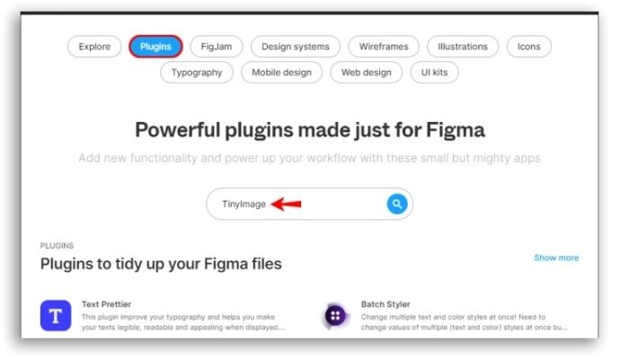
Among the best tools in Figma are Building wireframes, Table paste, and Lilgrid. And even though having a library of plugins is not exclusive to Figma, they make any project much more elaborate. While ready to use, these connectors provide your design with different layouts, import data in other formats, or organize information or elements.
3. It has the option of auto-layout
This facility is to make the designer’s life easier. After all, one of the great challenges of anyone who creates a new design is, precisely, to maintain coherence between scales, proportions, sizes, or spacing of each or between design elements. And this auto-layout function comes to make it easier, as it avoids misalignments and differences that could harm the aesthetics of your project.
4. Offers multiple integrations
Figma allows your projects to be integrated with other tools, such as Slack, Axure, and Confluence, in a very easy way and without bureaucracy. This feature ‘offers more autonomy to the teams involved in the projects.
5. Gives access to the global community
This perk here will make your eyes sparkle! Have you ever imagined being part of a community of designers, where it is possible to exchange knowledge, experiences, and tips? That’s exactly what Figma offers. You become part of a worldwide network of professionals that grows every year and the advantages of this are numerous, starting with the fact that you will never be alone in this sea of design again.
6. Easy sharing
Because it is collaborative, Figma makes life much easier for those who use it. Mainly because it makes it easier to share projects without having to export a PDF, make a print or upload files from the drive. This is because you can share all your work by generating a link. And even those who have the link to your work can follow your project in real-time.
7. Allows collaborative work
Easy project sharing brings another facility to Figma: collaborative work. That is, multiple people can access it at the same time. Thus, it is possible for the entire team to work together. And look how cool: Figma supports up to 500 contributors per file. Of these 500, 100 can be editors. As a result, Figma becomes the ideal tool for conducting workshops, design reviews, and brainstorming sessions, among others.
8. Weekly updates
Yes, almost every week Figma brings some updates to make your projects even better, more professional, and all this without being rocket science. In addition, through the tool, you can keep up with new market trends. And for those who want to improve their knowledge, this is all good, do you agree?
Inside Figma
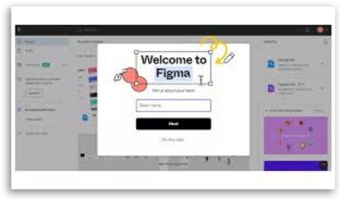
Now that you know the advantages of Figma, how about learning how to make a presentation with this tool? Before that, however, see how to use this platform. The first step is to create your account on the platform. The process is very quick and can be completed in just 4 steps. As soon as you complete your registration, you can access it. If you are going to form a team, that is, have people working together with you, just invite them through a link or via email. The cool thing is that you can start a project from scratch or from the available templates. In the meantime, if you have difficulty using Figma, you can explore the “Figma Tutorial”, a kind of virtual tour of the platform, which will guide you through the main settings, helping you to better understand Figma and how to explore it. Did you learn to use this tool? So now, see how you can make a presentation using Figma.
How to make a presentation using Figma
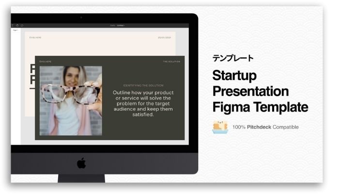
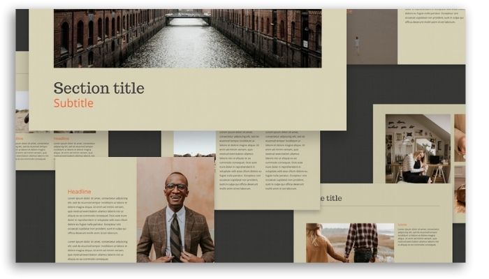
Figma is an extremely powerful tool that can be used for the development of different types of graphic pieces, from simple images for publication on social networks to the development of high-fidelity application screens. This is made possible by Figma’s prototype feature, which allows for various customizable transition options. Not to mention that you can incorporate plugins that will make your audience even more involved and excited about what they see. So, there are many ways you can make a presentation with Figma. Learn how to make amazing presentations that will take your work and your reputation to the next level.
See in practice how to create impactful presentations using Figma
1. Frame configuration
The first step for you to make a presentation using Figma is to set up a presentation board. To do this, open Figma and go to “New design file”. Then click on “Frame Tool (F)” to start working on your frame, or choose one of the templates, which can be found on the right. To do this, click on “Presentation > Slide 16:9”. From now on, you will actually start creating your frame. Then set a background color. However, remember that you can change the color whenever you want. The goal here is to make all the frames stand out by changing the fill color. Take the opportunity to rename your board by double-clicking on the blue title in the upper left corner.
2. Add the text
To add texts to your board, just use “Text Tool (T)”. You can set your text preferences in the “Text on the right” menu. A tip: Figma uses Google fonts, so get to know them to choose the best combinations. Finally, use separate text boxes when using separate lines, with only one or two words per line.
3. Time to place the images
It’s time to start bringing your board to life. Choose a photo – which can be a stock photo or one that you can take just for that. Then draw a rectangle with the “Rectangle tool (R)” to add an image. Your photo will be added according to this format. After that, just click on this rectangle and go to “Fill”, then click on the colored frame. Then go to “Solid” > Image > Choose Image” to find your image. Found? Go to “Open”. When hovering over the image, it will reveal 4 white circles. Click and drag a circle inwards to round the corners of the image. Now it’s time for you to arrange the circle layers so that the image is on the back and the text is on the top layer. To make this happen, you have two options: dragging the layers in the layers panel or using “Cmd/Ctrl + [“ to send a layer back or “Cmd/Ctrl + ]” to bring a layer to the front.
4. Time to create the first transition of your board
After following all the steps above, it’s time to create your first transition in your presentation using Figma. And this will open the image, allowing the title text to slide into the frame. Simultaneously, select the first frame and press “Cmd/Ctrl + D” to duplicate it. To reduce the image scale, simply reduce the height attributes in the “H” box to approximately 150, leaving a horizontal slit in the image. This process should be done in the frame on the left. Then, select both images in the frames, clicking “Option + V (Mac) or Alt + V (Windows)” to center it. To complete the image transition, select this photo on the left.
5. Attention to opacity
Afterward, you need to change the opacity to 0% by clicking the menu on the right in the box next to “Pass Through” under “Layer”. This step is important because it will make the image invisible before transitioning and opening. Then click the “Shift” key while holding it down in the first text box. You will start dragging this text box out of the frame while holding down the spacebar. This spacebar command is important to prevent the text box from disappearing out of the frame and the transition being successful. So: hold the spacebar before dragging, so it just moves your frame. Once this is done, repeat the process for the second or subsequent text box. However, drag them a little further to the left to add some variety to the transition. At this point, while the text is still selected, you can reduce the layer’s opacity to 0% in the same way as you did previously for the image.
6. Defining the transition
To define the transition, you must go to “Prototype”. There, you will select the frame on the left and click on the blue circle that appears in the center of the right side of the frame. Once that’s done, drag it so that the line goes to the second frame. In the drop-down line that says “Instant”, you will select “Smart Animate”. Soon after, you can change the box with the timer to 1000ms. The result of this? Your transition will be set to take one second from the mouse click. The other settings should be set by default. To do so, make sure not to rename the frame titles after defining a transition, otherwise, the files will not be connected. It’s time to test your transition. Just click on the “Play” button. Then, to continue your presentation design, just go back to “Design”.
7. Time to add more slides to your Figma presentation
That part is easy. If you want to go from slide 1 to slide 2, just duplicate the rightmost slide by clicking on the command “Cmd/Ctrl + D”. On slide 2, just move the text boxes out of the frame using the command “Shift”+ press the spacebar and then start dragging. Then you can move one of the text boxes to the left and the other to the right of the frame. Afterward, set the opacity to 0% for both. For the image, move it off-center, making it smaller. At this point, set the opacity to 0%. This action will give you a blank canvas for the second slide. From now on, you can add whatever content you want on top of the invisible assets on the previous slide. Then add a large image in the center of the frame, and if you want to put some decorations on top of your image, use a Figma plugin for Gifs or download a sticker Gif from Giphy to drag it on top of the image. Once this is done, you can select the main image and any Gifs, grouping them through the command “Cmd/Ctrl + G”, this ensures that Smart Animate works correctly. In the next step, you can select the group and copy it, using the command “Cmd/Ctrl + C”. In the next step, you can paste it into the frame of slide 1 using “Cmd/Ctrl + V”. The next step is to reduce and set the opacity to 0%. Then, move this layer back through the command “Cmd/Ctrl + [“. This action will ensure a smooth transition to the next slide. Once that’s done, let’s move on to the next phase.
8. The prototype phase
After you’ve ensured a smooth transition to the next slide, you go to the “Prototype”. Now, you can select slide 2 and click on the blue circle to drag it to slide 3. Figma’s default in the prototype menu is to use the previous settings, so they must all be set according to the previous transition. Go back to the project. Then you can duplicate the last slide with the command “Cmd/Ctrl + D”. This slide will use the same image as the previous one but scaled to one side of the frame. From there, you can move the image to the left of the frame by dragging it while holding down the “Shift” key. Now, hover your mouse on the right edge of the image until the opposite arrows appear, click and drag the right edge of the image to the left until you are satisfied. From there, go to “Prototype” to link the two frames. Then go back to “Design”. Immediately place a title and body text to the right of the scaled image to group them together. Then just copy the text group and paste it onto the previous slide by clicking and dragging the text group to the right of the frame as before.
9. Add a mockup
In this step, you can create a mockup for your Figma presentation. To do this, simply add a new frame and paste your mockup into it, resizing it to fit the frame. Then, just copy this mockup and paste it into the previous frame. Resize the frame to fit the part of the image, and move it to the back of the layers. Afterward, you must set the opacity to 0% and link the frames in “Prototype”.
10. Add labels
You can now duplicate the mockup board and add a title and description to explain parts of your model. The next step is to group the text and name it. You can also create a frosted glass indicator for your markers and lines. To do this, just group a line with a circle. Right after that, align your indicator with what you’re describing and add your description next to it. Frames must be linked in “Prototype”. Afterward, just duplicate the frame and add another bullet pointer with what you’re describing. Prototype this again and duplicate each frame per bullet point, so that each bullet point transitions itself.
11. Time to finish the presentation
Shall we go to the last slide of your Figma presentation? To do this, simply duplicate it, writing a final word or two. Center the words, copy the text and paste it onto the previous slide. To shrink text, hold down “K” while scaling it – this will keep your text formatted as you shrink it. Then just place your text somewhere near the top of the mockup and send the layer back under the image. The next step is to set the opacity to 0%, going back to the final slide. You can now move the other objects out of the frame using the drag method. That way, the transition will slide everything sideways and up as the text moves down and expands. The slides link is in “Prototype”.
12. The time of presentation
Your project is ready and it’s time for you to share it. Just log in to your Figma account or share the URL with others, so they can see your presentation from anywhere. To make your final presentation with your transitions, you will click the “Play” button and choose the full-screen mode. Your frames can also be saved as PDFs. However, in this option, you will miss the animated transitions.
Did you learn all the steps to create a presentation in Figma?
Now that you’ve learned the step-by-step guide to creating amazing presentations in Figma, how about sharing this knowledge with your friends? Take advantage and forward this article to those you know will like it!
